The time has finally arrived. The ultimate test of a future graphic designer's life: The Final Portfolio of the year for Vis Com II. It doesn't even seem possible. So much has happened, so much has been accomplished (or not), and so much has been learned. I made a vow that I would not have a repeat of the first half of the semester in my previous midterm portfolio, and in some ways, I feel I have done an excellent job rising to the occasion. Not everything went smoothly, of course. There were still plenty of bumps in the road, some of which were my fault and others that were totally out of my control.
One thing I can pride myself upon is my ability to personally invest in most of the projects of this semester. With the How Safe? magazine spread, I consulted my parents on what to do for photography and making a carrot look shriveled and venomous, getting them actively involved in my work. For Secret to Feeling Full, I used the imagery of my own torso for a figure that was not perfectly model-esque or thin. Every project was named that involved a woman spokesperson, and oddly enough, that was all of them. Sandra (Wick Fowler's) came to me like a bolt of conceptual lightning, and she and I have been partners ever since. She was my first successful tablet digital paining since my Border Collie from Illustration last semester. I've bonded greatly with her, through the gonzo typography, horrible logo and commercialized fonts, the improvements in Photoshop animation. Then there is Daisy (Gatsby book project). She was inspired by an ad in Vogue, and her art deco appearance just magically appeared. It took the two of us a bit before we could transition to 4 color instead of two, but we managed to find a lovely 1920s complimenting color scheme that really turned out swell. Angelique (Black History) readily leapt forward for a concept. She told me to search African patterns to reference her heritage that she sings so fondly of. Said music carried me through her creation. Then of course, we have dear Florence, the Yoo-Hoo-loving mother. She was one of my favorites and the project became a delight because of her. The fun was never ending with cheesy 1940s-50s style, fonts, and catch phrases. Then, of course, we see some old favorites: the lady Jazz flapper, Snakey from the Herpetology project, the adorable MU vet brochure, and my knitted creations for Red Barn. All my fondest pieces, all here for final display, to show my evolution and potential as a beginning designer. Some I am more proud of than others, but they all earned their place for a reason.
In terms of time in creating them, I came out much better in budgeting than in the first semester. Excluding the time it took for How Design and Society of Illustrators, the total budgeted time was 84 hours. Altogether, I worked 80. Where those other four hours slipped off to, I cannot say, but you must admit, MUCH better than last time! :D And Lord only knows what these babies could have looked like if I didn't have Printmaking, Survey II Art History, Public Speaking, etc. Granted, this included many revisions, all done for the good of the piece. Illustration took up most of my budgeting time. No matter how my speed picks up when illustrating, it is my main personal investment (seeing as that is where my initial talent and skill lies) and generally takes the longest. The next biggest time consumer is figuring out and constructing multiple parts to one piece. Wick Fowler's had three posters, two ads, a can label, and a gif. Doesn't sound like much, but sheesh! It takes quite a while to do all that in one fell swoop, don't cha know?
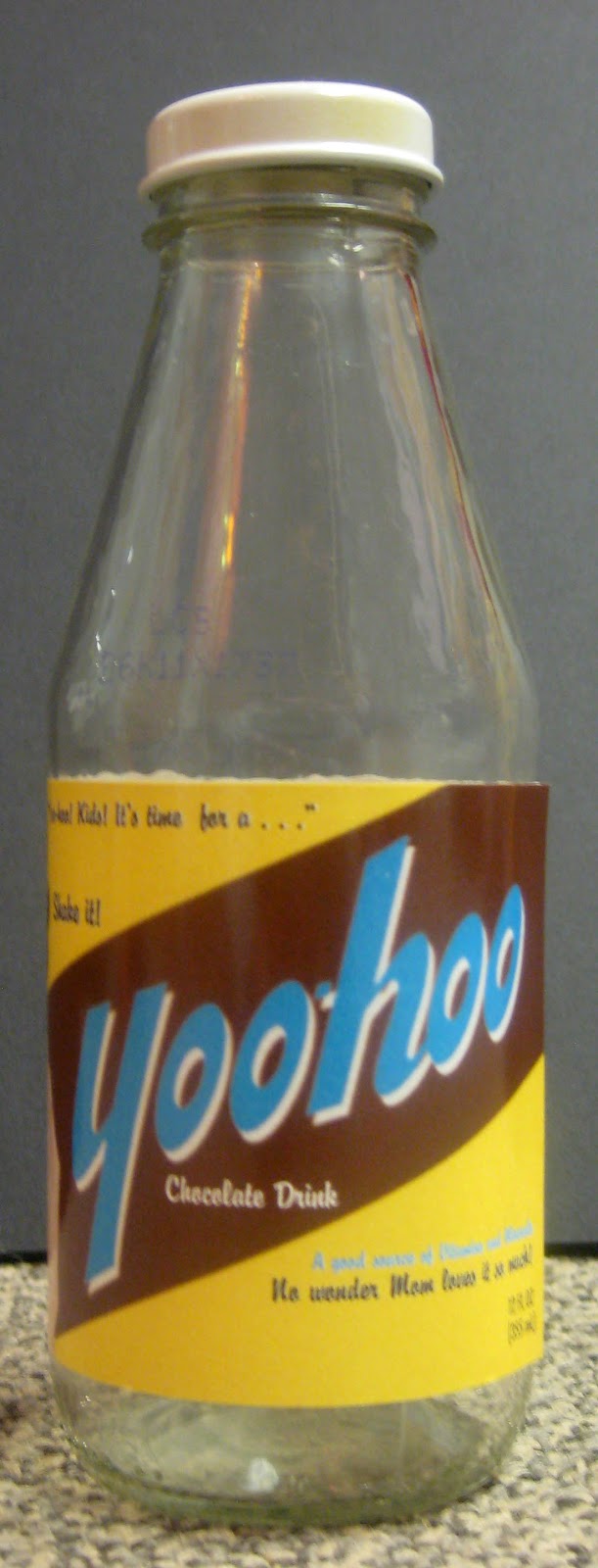
Now, despite all that has gone well, there have been a few mishaps. Not everything was able to be approved in time for this portfolio submission. The two magazine spreads I previously mentioned are the two that are not marked with a red okay. But time simply ran out before I could get them approved. This is due to putting them off in favor of other projects, which is entirely my own doing. Also, the abandoned projects that did not get to the final portfolio have very little work on them due to placing other projects first as well. Society was at least conceptualized and drawn, but not painted, nor organized typographically. So little was done on How Design that there is really nothing to place here. Other issues arose. When I sent my Wick Fowler's to be printed, they were done on the HP printer without explanation, infuriating me. The quality of the images suffered, but I did not have the time or money to reprint them in time. Construction of the book jacket and beverage design was also thorny. Though the Yoo-Hoo package works, there is no way it can carry the weight of six glass bottles the way it is designed to. I did not measure the spine of the book jacket properly, so it has no book to fit around, and the size is obscure enough that I cannot find a replacement in time. But everything has been done, it is all ready. Though, I can't make any promises in regards to the production files; they are still giving me trouble!
52 images. 80 hours. Plenty of Buch-a-Crunch and Mtn Dew LiveWire later. The final portfolio is here, for all to view. This is the labor of a semester. The fruit of my time and artistic ability. There has been love and there has been hate. But most importantly, there has been evolution and productivity. Ladies and gentlemen, I present it to you.
Thank you so much and enjoy! Good night!
And as always,
Cheers!