 |
| Hahahaha! And this is so NOT Halloween. This is an old painting I did in my sophomore year of high school, I think. XD We had to make a collage and then paint it. Despite the inaccuracies, I am sort of fond of this one, simply because it took longer than you would think, and it has all the Disney gals I like best. Good luck finding Captain Amelia on any Princess collage anywhere else! :D |
Saturday, October 22, 2011
Personal Piece #13
Uh oh! Unlucky piece #13! Halloween IS coming up . . .
Comps, comps, comps
Howdy all!
I haven't much to say today other than DO YOUR COMPS THE WAY YOU WANT THEM EXACTLY. LOL Sorry for the explosion of capital letters there, but seriously, learn the lesson. Be a better person than I am. Rusty is a kindhearted soul who took pity on me Friday (a day on which end of week fatigue left me worthless mentally and emotionally XD). He approved what I came up with, despite the inaccuracy in size. Thank you, Rusty! I owe you my heart, soul, and spleen . . . and pretty much everything else I have. XD
SO. Re-comped "Death of a Hat" which could possibly be interpreted as death of valor, chivalry, culture, gentlemanliness. Whatever you would like to interpret it as, really. Another thank you shout out to Jude Law for serving as my reference model, playing Dr. Watson. :D
 |
| Life: Gentlemen wore hats . . . |
 |
| Death: The elegance of such a culture is no more. We go about bareheaded. Hats no longer signify our status, our social grace. Tragic, in a way . . . |
Tuesday, October 18, 2011
Personal Piece #12
Phew! After the stress of the midterm portfolio, what do we have for the night's fun piece?
 |
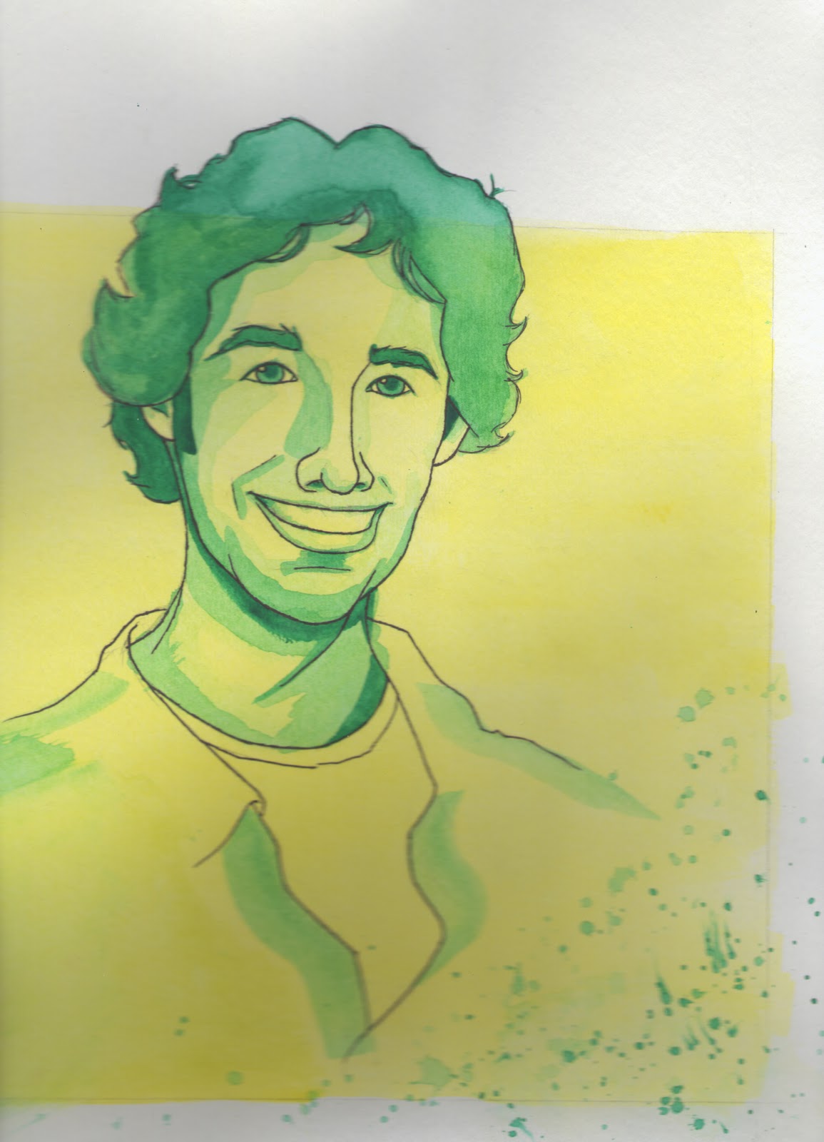
| Ahhh, M. Cyrano de Bergerac! Whoever said this man's nose is grotesque, they need to rethink a few things. A master of poetry and love, he is by far, the ideal man. I am looking for my own Cyrano, where ever he may be. Perhaps he speaks French . . . after all, Cyrano does. :3 <3 |
Midterm Portfolio
It has finally arrived. Midterm. It doesn't even seem possible. So much work has been produced, but now comes the time to narrow it down to what one hopes is a cut above the rest. This is the time to reveal just what has been learned and put into practice. I can only hope that I've made the right decisions.
There was so much line art to sift through that I battled internally with myself for quite some time. Many were strong in some aspects of the piece, but not all. The two watercolors, one would think, would be the two large scale landscapes that we were instructed to do, but I was not satisfied with either of those pieces. I was actually partial to the earlier works, like the small scale landscapes and architecture. The product illustration was a given for me too, although I feel that I could have added another dimension to the piece . . . though I was terrified of ruining what I fundamentally laid down. With watercolor, I was quick to learn that a little can go a rather long way.
The next three watercolors with line art were based on personal favorites, I must confess. I know that is probably not the best way to go about choosing pieces for a portfolio, but these three have been near to my heart since they were released from my brushes and pen. Ironically, they are all portraits . . . come to think of it, it isn't ironic at all. This was my favorite subject to render before I took any formal art classes. They are very much me. My intention has been to branch out, away from my comfort zone, but as I told my professors during Proficiency, I am slow to adapt. That is, I embrace new concepts and ideas. I am eager to learn new things. However, I can't master new things right away. It takes me longer to adjust and grow comfortable with new ideas, medium, you name it. Add several at once, and you have chaos. But I do try! I enjoy it so very much! But I require a little more practice and time than others, I suppose. But such evolution had certainly occurred within this class.
For the gouache, I chose iAbe. Though his background is still not 100% to my liking, I, in general, like him. He makes me smile. He is also my first real evidence of tackling the medium and knowing how to make it do as I desire. This would represent the grasping of a concept, or the success after spending time adjusting, as I just mentioned. My personal favorites to learn and work on were the digital illustrations, though. Not gonna lie. I will be broken hearted when I must give the tablet back at the end of the semester. Just knowing that something can be rendered by hand, but be directly on a computer screen just blows my mind. It's exactly like learning how to fluidly type on a keyboard so you don't have to write all your documents by hand and transfer them onto the computer later. It's brilliance. It is beautiful. Quasimodo, although he is copyright of Disney and not my own original work, was the best of the first line art illustrations on the tablet. The boarder collie was actually enough to make the virtual refrigerator. Nothing could have made me happier than seeing that on the blog! I felt worthy of something inexplicable from that moment on. "I can DO this!" I thought to myself. Hence, it was only fitting to place it here, in the midterm portfolio.
The final piece was up to me, so I went purely off of what speaks to me. It may not have been the best montage out of the class, but I have grown so very fond of this. It has so many beautiful memories attached. I worked on this the night I cut and mounted my poster for Vis Com I. I had no gouache yet because my mother was bringing it to me after her trip to St. Louis. Kat and I painted all evening, laughing, talking, listening to Ludo and Panic! At the Disco. It was my first time figuring out gouache, and although it nearly resulted in tears of frustration at the time, it was such a beautiful moment of discovery and possibility. I laugh when I think of Rusty's candid suggestion to draw Bela Lugosi, Kat's observation that a cupcake was the farthest thing from Dracula, and Tim's insightful hint that an animal, especially a koi fish, would tie everything randomly together. That, my dear children, is why this is my final piece within this portfolio.
Thank you so very much. I hope you will observe and enjoy.
Cheers!


Monday, October 17, 2011
Personal Piece #11
Personal art time! *closes eyes and reaches into the files*
 |
| Ah HA! My collage to see if I could fill an entire surface with doodleage. I love this piece. If you can name every reference in here, you are seriously amazing! :D |
So much done, so much more to show and tell!
Howdy all!
Well, a few days of rest and relaxation for midterm has come to a close and that, of course, means back to work! I've been getting slack in my blogging, but luckily, I have plenty to share! Let us first begin with what became of Mr. Lincoln's illustration shall we?
I was happy with how the gouache rendering of Abe himself turned out. The tremendous size of this illustration literally killed my white and purple tubes of paint. For inexplicable reasons, the color was altered on the actual printed version, and this troubles me. I fixed the color in Photoshop accordingly, and it looked fine on the computer screen . . . and I ended up with varying shades of blue instead of purple. Humph, I say. Oh, and just to clarify (coughRustycough) good ole Honest Abe is listening to Southern rock. Let the funnies commence!
Now, the next project we have here is the "Five" project. That's the only rule, that. Five, demonstrated in some illustrated way. My original intention was to still use the Little Prince theme, but I was going to show the lessons the Prince takes from each planet he visits. Unfortunately, there were six planets and strange grandes personnes, and I couldn't really combine any of them. So, I decided to metaphorically represent the success to a fulfilled life using the Little Prince and his closest encounters. The five most important representations are 1. The individual itself (the Prince leaving his home planet), 2. The challenges one faces in life (the baobab trees consuming the second planet), 3. The parent (the pilot), 4. The best friend (the fox), and 5. The lover (the rose). It's rather abstract, but that book touches me so much that the idea just stuck and wouldn't leave my head. Fortunately for me, this illustration only had to be 13 X19, so that meant less painting, but a lot more problem solving when it came to scaling my drawing size down. Drawing II conditioned me to not be small and intricate with my drawings. I now find it difficult to draw tiny pieces.
Next, we have the color comps for the following project, life and death. Once again, I think I am letting my imagination run a little too far from the literal. I had three ideas that were inspired by my favorite poet and author. The first was taken from the Elegance of the Hedgehog by Muriel Barbery. Life is depicted as Paloma, an extremely insightful and intelligent little girl who has figured all of life out and realized that is all a sick hoax, really. She plans to kill herself on her 13th birthday, just because she sees no point in living what she understands as pointless in the end. However, she meets the mysterious concierge Renee, who seems to be a dumpy, dull-witted worker by day, when secretly, she is a brilliant woman and a lover of film, art, literature, and culture. Just as Renee is revealing her true self for the first time, no longer acting like the little hedgehog she is, she meets an untimely death, and inspired by her, Paloma decides to live in her honor . . . and decides there is more to life than she had figured out. Life was drawn here as Paloma, and the little hedgehog was supposed to represent death.
The next ideas were inspired by Billy Collin's poems, The Death of a Hat and The Death of Allegory. Throughout history, gentlemen have worn hats. They told everything about a man, from his status to his personal spirit. But such traditions are long gone. For the most part, if men do not go bare-headed, they wear ball caps . . . good and well, but not nearly as passionate and beautiful. The next was much harder to explain in a drawing. The first piece is supposed to be a medieval drop cap of say, Chastity, represented in something grander than itself. The other is simply a razor in an ashtray (Collin's own example) of an ordinary object symbolistic of nothing more than itself. Life and death . . . life and death.
My plan is to rework the hat comp over for Wednesday, just cuz it's my favorite, other than Hedgehog. That one, I'm afraid, is just too dependent on context. No one would get it if they have not read the book. But the suits me just fine. I'm enjoying these projects! Stay tuned for more, if you so feel inclined! Haha!
Cheers! Love to all, and goodnight!
 |
| iAbe |
 |
| Le Petit Prince's Guide to Life (Five Project) |
 |
| Life and Death: Paloma and the hedgehog |
 |
| Life and death: hats |
 |
| Life and death: Allegory Chaucer: "Right, well, it was allegorical." Roland: "Well, we won't hold that against you. That's for every man for himself to decide." --A Knight's Tale |
Monday, October 3, 2011
Personal Piece #10
Dun, didda dun didda dun dun dun dun duuuuuun. Diddley bup diddley bup diddley dub dee dee duh dee daaaaaahhhhh! *gasp, pant* Dee dup dee dup dee dupadee DAAAAAAHHHHHHHHH!
 |
| Awwww, it's Clopin and his wife, Rebecca, created by my dear roommate and best buddy, Ashlee Estep. :D |
Montage of Epic Randomness
Okay, maybe that title is giving the piece too much credit. lol
May I begin by saying gouache is . . . interesting. Likes: texture and manipulation is similar to watercolor, pigment is very vibrant. Dislikes: rub over it a few strokes too many and you have a white surface. I mean, for effects, the add water disappearing act is fantastic. For editing purposes, not so much. Messing around with the painting should not be done lightly. What is my overall feeling regarding gouache? Eh, it's alright. I like it enough. I just need more experience with it. I personally think this was kind of a big undertaking for a first project using gouache after little practice. I need to make time to practice on my own. Oh well, Honest Abe will be practice enough. *nod nod*
So, about this piece . . . I have no idea. XD When asking for random subject matter suggestions, Rusty brilliantly suggested Bela Lugosi. My first thought, "*GASP* Yeeeeeeeeeeessssssss!" Had to be done. :) Then, asking my fellow art buddies what would have nothing to do with classic Count Dracula, they suggested the farthest thing: a cupcake. It made me smile. Then the other random thing became a koi fish. Just for giggles. By the way, if you ever do a Google image search for "koi fish" there is about one good, actual photo. The rest are tattoo designs. So, these three items morphed together to become the randomness that IS my interpretation of the three piece montage.
I did some tweaking of details and I think they have immensely improved the piece. I'm sure there is much more to do, but I've come to the point where I feel I will really mess this lil bugger up if I do much else. I know "I like it" isn't valid under any circumstance, but hey, I like it. :D
Thanks all! Cheers and have a good week!
 |
| Three piece montage, baby. Dracula, cupcakes, and koi. It doesn't get much better than this. XD |
 |
| Abe! We have to present and get color comps approved of an Abe Lincoln illustration for a local contest assignment. I imagine Abe gets a lil bored sitting in D.C. day in and out. So . . . give him an iPod. Rusty says he's listening to rock. Hahahaha . . . :D P.S. Color on background will NOT look like that. Much smoother transition. |
 |
| Feast your eyes, my dear children. THIS is Rusty Nelson verification and approval. :D |
Subscribe to:
Posts (Atom)