Sunday, December 11, 2011

Final Exam

It all comes down to this. An entire semester of Illustration, here in an instant and gone in a flash. So much work has been produced over the course of the semester, some much better than others. But this is the final examination: a time to celebrate the closing of a class by featuring only the best, and if not, the good.

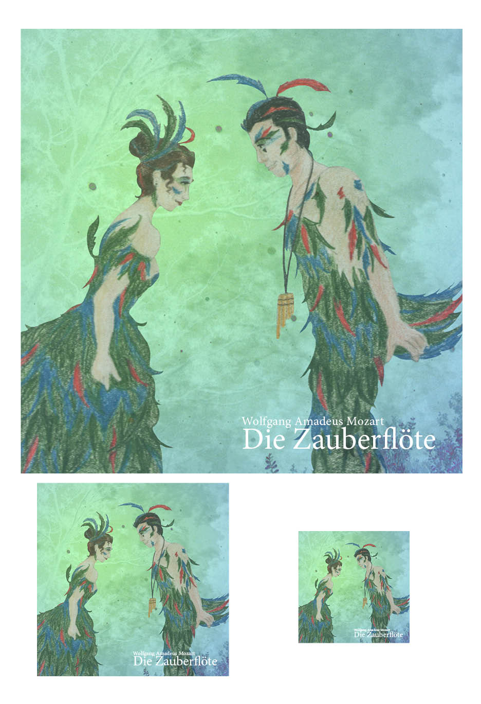
Out of the eight assignments the second half of the semester produced, it all narrows down to four. Four pieces will decide my fate. My grade is resting solely in my own hands. And do you know? I'm feeling sure of my choices. The grade itself, one will only know with time, but the pieces . . . I've gone over them again and again, selecting the four I find to be most worthy.

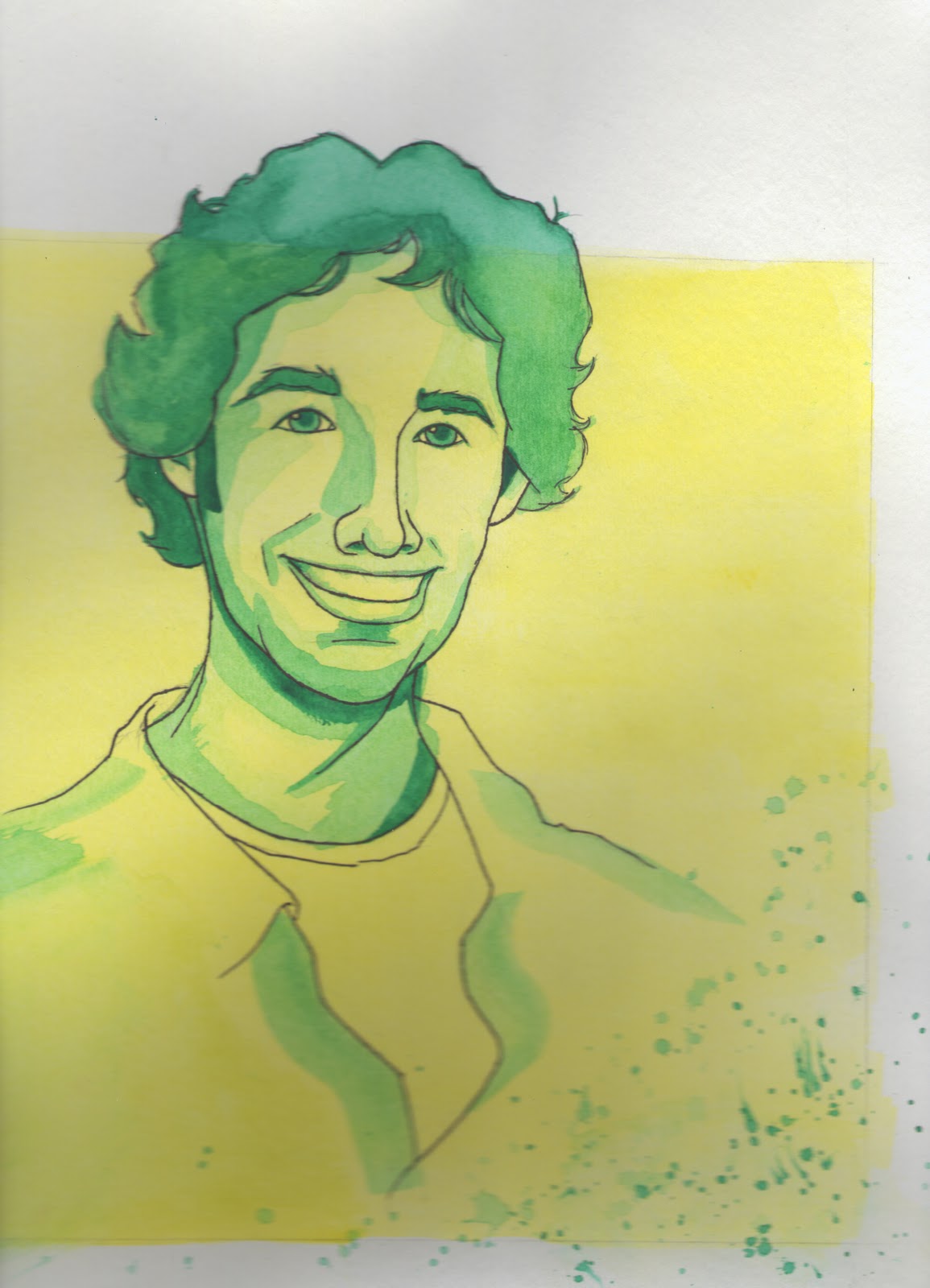
I want to begin with good ole Honest iPod Abe. He was my second major gouache piece, and arguably one of the biggest paintings in my pile of work. He is one of the most beloved among my friends and family members and the same could be said for me as well. Abe, I love you, despite the fact that you literally murdered my tube of purple gouache, and came uncomfortably close to killing my white. You sit through the monotony of D.C. tourism with a content smirk on your stone face, listening to Southern rock. You are Final Exam Piece #1. Congratulations.

Secondly, I chose my Life and Death illustrations. Why, one might ask. The truth is, I am rather satisfied with how they turned out. But the thorough truth of the matter is, this was the piece I conceived and thought about the most this semester. This piece went through three evolutions: The Elegance of the Hedgehog plot, the life and death of hats, and the death and life of allegory. I referenced and revisited literature I have loved for years, works that inspired me deeply. In the end, it was the hats that reigned victorious due to their less obscure content. Thank you Life and Death. You are Final Exam Piece #2.

Next, I wanted to include my Native American Heritage poster. It looks simple enough. The typography still might not be the most groundbreaking. But again, I feel accomplished with this piece. I feel the illustration is done well, from the original sharpie coloration to the digital touch-ups. This subject was also near to my heart. Memories of Mr. Malia and Crow Canyon filled my mind as I worked on this piece. I wanted to make something that would honor him, that educational voyage. I researched Pueblo pottery just to stay true to my experience. I did not grumble when others did. I wanted to do this piece and I regret nothing. Take your place with pride, Final Exam Piece #3.

And now, finally and fourthly, we have something new. Something no one has seen before. Book cover, this is your moment. Harper Lee's To Kill A Mockingbird has yet another cover to add to the myriad it already possesses. A story so profound deserves to be honored, and I did not want to disappoint. I am satisfied with my result. Despite all the action, beauty, and suspense of the story, I was lucky enough to show something much smaller, but no less significant. Atticus and Scout, embraced together; the daughter listening to her father's watch, knowing he is near. This is my last gouache piece for the semester, as well as the last in general. Book cover, love, you are the last and Final Exam Piece #4.

There we have it. The final portfolio. So much has happened in this seemingly lengthy or short period of time. I've been introduced to new mediums, new challenges. I've bought more foam core than I would like to admit, with the intention of never stopping. I have laughed and I have cried. I have worked and I have been a lazy bum. I have woken up at six every other week morning, done all I can, and now, it is coming to a close. One more thank you must be said.

Thank you Rusty, for being there to guide, scold, and critique. Thank you Illustration class, for broadening my horizons, challenging me, and pushing as far as I could go until something tragic or beautiful happened to me and my life.

#1  iAbe

#2  Life

#2  Death

#3  Native American Heritage poster

#4  To Kill A Mockingbird book cover 

Personal Piece #16

Okay, y'all. Ya know the drill! :D

Aww, illustration for Ashlee's Dracula novel. <3 

A little catching up to do

Right then! Hello friends!

Someone naughty has not been keeping up on their blogging very well. Not that she does not want to share, or wants nothing to do with her adoring audience (giggle) but she had been so involved in life at the moment that she . . . this is solid honesty, here, not procrastination . . . forgot about blogging. I know, I know. How could she? The selfish wretch!

Well, never fear. She's back! Yay or nay, whichever you would like to proclaim and sing. :)

Quite a bit has happened in my Internet absence. I have several pieces to add. I am running out of time, after all. The final is tomorrow, and all my previous work, if not selected for said final, must still be displayed here for all who wish to see. So . . . let's get down to business, shall we?

The first thing I'd like to add is my final version of my Native American Heritage Month poster. I realized that I never added the finished product, so I am going to do so now, at this glorious opportunity. I fixed a few things here and there . . . damn you, typography. :)

The next piece is the classical album cover for The Magic Flute of Papageno an Papagena. This did not turn out as I had anticipated. Time ran out, and is continuing to do so, so this piece is not up to my expectations. I mean, it's cute. I don't hate it or anything. But I felt I could have done so much more had the circumstances worked out better. College is draining me slowly. Cue Ludo song "Love Me Dead." SO my life right now. But yes, the two lovebirds have finally been completed. Maybe altered to something more if I ever receive the chance.

Next piece is interesting . . . to say the least. Illustration of a magazine world record. The nerd in me wanted to do largest collection of Pokémon merchandise. I really want to learn to digital paint. This obviously isn't supposed to look ground-breaking. Pokémon pretty much look like this, in terms of color and line art. It looks elementary, and well, it is . . . with reason, as I say. The hand posed as an issue. I tried to draw it in the same style multiple times. Good grief. Looked AWEFUL. I would like to spend time with Photoshop and a tablet and just practice for hours on end. My border collie at the beginning of the semester shows that I CAN paint digitally. I just need time and practice to be good at it, and I really do believe I COULD be good at it! It's fun! And "easy" and "quick." I didn't want to use it for a finished piece just because I know I don't have the hang of it yet, but I selected it because once again, that's how Pokémon are drawn, for the most part. I wanted to stay true. There must be a better way to blend and illustrate skin. That is what gave me grief with the hand. It just looked . . . bad. The photo was a cheat, yes, but I was desperate. I know I can do better work that this also. These last few pieces do little to represent my work as an artist. I know that. But I am trying. More than anything, that is what I want everyone to know. It might not seem like it, but this semester has been the most taxing time of my life thus far. That I can say without exaggeration. I don't wish to use this blog to complain or praise my own life, but my own life does affect my work. I just want you all to know that this is what I want, and I do want to do my best. This last little leg of the semester is just a bump in the road in a long journey forward.

Wow. Okay, um, that got depressing and profound really quickly. :) Let's snap out of that sadness, shall we, and focus on a new one. I have to turn my tablet back in tomorrow! Whaaaaah! I'm really gonna miss it. It makes cutting things out in Photoshop SO much easier! lol I even made a cover for my homework folder in religion (extra credit) just by going nuts in Photoshop. Heheh, I should post that too, just for the fun of it! Nothing outstanding, I assure you, but I had a blast!

Oh, also, I have a sneak peek of the next project, the book cover Illustration! To Kill A Mockingbird, to be precise! I love the fact that Rusty chose this idea. I really wasn't expecting it, and was delightfully surprised. This is my favorite scene in the whole book, and probably one of the most insignificant. But it is also one of the most beautiful. Scout hugs her father, Atticus, and simply listens to the soft ticking of his watch in his vest. The painting on this was not cooperating earlier, but dang it, I am enjoying this piece's concept, and it shall not ruin me! I shall persevere!

Finals, and then Christmas break. A weekend with my best friends, a concert I enjoyed, relaxation for just a little while before the last week of the semester. Yeah. I'd say I'm doing well. Happy, well, everything, everyone!

Cheers!

Final Native American Heritage Month Poster. Oh yeah! 

Les CD covers, in record, CD, and iTunes formats and sizes 

Comp for Pokémon record

THE Pokémon record :D 

Sneak preview of Scout and Atticus

Religion folder cover! Can anyone name every religion? You get brownie points if you can! 

Wednesday, November 9, 2011

Personal Piece #15

Ahh, it is late, but I cannot finish blogging without adding a personal piece . . .

Another Dracula! No, I wasn't on drugs when I colored this. The stage lighting of Dracula: Entre l'amour et la mort really does look that trippy. XD

Long time, no blog

Well, it is twelve minutes after midnight, and here I sit, typing away at my Mac with fervor by the light of my desk lamp, listening to the gentle breathing of my sleeping roommates. It's peaceful tonight. Just the clack of my fingers against keys . . .

A few updates for you. I have the original Native American Heritage poster comp mounted, just because I feel guilty for not remembering to do so the first time. One would think that I would not forget these things by now. Then, may I present the finished illustration of the Pueblo pot that simply needs a burnt sienna spot  color and a poster design to accompany it. Lastly, I have my comp for the next assignment, the Classical album cover.

Sorry Rusty, but I love operas. Especially if they are composed by a certain Wolfgang Amadeus. Favorites among? Magic Flute, hands down, followed closely by Don Giovanni. Have I actually seen these pieces? The sad truth of the matter is no, but watching Amadeus alone has instilled in me a longing to do so. But I do love the music, which is why I had to pursue one of Mozart's works for this project. I decided on Flute primarily in the comps, simply because it is more whimsical and resembles something I would have drawn in my youth. Of course, I had to center on Papageno. I mean, he's a lovesick bird who finds his sweetheart through music. What is not to love?

My original sketch was going to feature just Papageno dancing and ringing tiny bells, as he does in the Amadeus film. But the more I played with that idea, the worse it became . . . Then I did some song searching on YouTube and realized that most album covers that feature Papageno do not feature him with his soulmate, Papagena. So I decided to change my concept up drastically. The pose was vaguely inspired by the film cover of the French classic Cyrano de Bergerac and the costumes for the lovebirds was based on this video:

http://www.youtube.com/watch?v=87UE2GC5db0

Ironically, the play is sung in its original German, but I was able to translate by reading the French subtitles. :) I've yet to receive proper approval, but I really hope this can make it to gouache or watercolor!

Tonight has indeed been a good evening. Sleep well, one and all.

Cheers!

Mounted comp--Native American Heritage Month
Finished illustration for said Heritage Month
Sketches, The Magic Flute
Sketches continued: Approved Papageno


Papageno and Papagena! <3

Tuesday, November 1, 2011

Personal Piece #14

One more for tonight, I promise! And it is . . .

Ah haaaa! Dracula, the King of Vampires. Lord of Darkness and Night . . . and sexiness. XD This is actually Bruno Pelletier in the role of said vampire. Oh, and that odd splash of red on his belly is lighting from my reference, in case you were wondering. :3 

Whoa! Totally forgot!

Sorry for the spam, but I forgot to post the painted, finished version of the life and death of hats! And just to celebrate such forgetfulness, I am going to show you the original photo, no doctoring in Photoshop or anything. Just the paper, my carpet, and my feet holding it down so it won't wrinkle. LOL

Cheers!

A little catching up and a lot to cover

Good evening, all!

Much has happened since our last online rendez-vous. Societies of Illustrators and Native American heritage, yo. Um, let me explain . . .

We need to create an illustration worthy of the mailing brochures of the Society of Illustrators. The more creative, the better. No pressure whatsoever. :) Let me just say, fail on my part. I mean, I like this piece and how it is coming along, but is it Society material? Not even close. I don't see how it could be. But my mind went flat out dead on this one. Creativity went *fizzle, phlatz* Nothing. But I did take the illustration aspect to heart. I don't know how many times I'll be drawing in public, like at a favorite cafe, and I'll glance up to see people watching me. A look of panic flashes in their eyes. They know they should respect me and not look at my progress. It makes me giggle. It's sweet of them, but they still can't help themselves. I know some people really don't like being watched when they draw, and I respect that, but I am not one of them. Go ahead! Look! If I didn't want you to see, I prolly wouldn't be drawing it in a public place. lol

Hence, this illustration. Like I said, meh, but for just an illustration, I'm liking it. The process for this one was intense. I guess I can't measure and scale. XD Rusty has tolerated my inability to do this, but I think I'm getting a teensy bit better. I've collected the whole start to finish with this piece, save for the finished painted one, but that will follow shortly. It's not ready yet. *shoos you away*

Now, this next project is my favorite thus far. I know, right? Everyone else has been grumbling about how much they hate it. But not me. No. I love this project! We have to design a dual color illustration and poster for Native American (not North American XD) Heritage Month. The trouble? Staying away from cliches, or in some cases, political correctness. But those issues didn't even cross my mind. I've always been fascinated with all aspects of Native American culture. My family contains large amounts of Fox Indian, and I took an expedition to Crow Canyon Colorado with my LEAP class my eighth grade year. I studied Pueblo art and culture extensively there, and it has stuck with me ever since.

That was where the Pueblo pot design came from. And it was the one Rusty liked best. The others came from fond memories. The flute player is actually David Nighteagle, whom I saw perform live in Colorado (and I stupidly didn't bring money for a CD). The Indian maiden and wolves have been around even longer. I used to draw them together when I was a little girl. Constantly. I would sketch them in pencil and then make their eyes emerald green. Two dramatic colors, just like this project. Needless to say, they reappeared in my thumb sketches. I seriously can't wait to finish this one! I care about it so much . . . how can it not end well? Well, apart from stuff like printing issues. XD

Ohh, thank you for listening to me ramble, peeps! Enjoy the art and good night! <3

Cheers!


Saturday, October 22, 2011

Personal Piece #13

Uh oh! Unlucky piece #13! Halloween IS coming up . . .

Hahahaha! And this is so NOT Halloween. This is an old painting I did in my sophomore  year of high school, I think.  XD We had to make a collage and then paint it. Despite the inaccuracies, I am sort of fond of this one, simply because it took longer than you would think, and it has all the Disney gals I like best. Good luck finding Captain Amelia on any Princess collage anywhere else! :D 

Comps, comps, comps

Howdy all!

I haven't much to say today other than DO YOUR COMPS THE WAY YOU WANT THEM EXACTLY. LOL Sorry for the explosion of capital letters there, but seriously, learn the lesson. Be a better person than I am. Rusty is a kindhearted soul who took pity on me Friday (a day on which end of week fatigue left me worthless mentally and emotionally XD). He approved what I came up with, despite the inaccuracy in size. Thank you, Rusty! I owe you my heart, soul, and spleen . . . and pretty much everything else I have. XD

SO. Re-comped "Death of a Hat" which could possibly be interpreted as death of valor, chivalry, culture, gentlemanliness. Whatever you would like to interpret it as, really.  Another thank you shout out to Jude Law for serving as my reference model, playing Dr. Watson. :D

Life: Gentlemen wore hats . . . 

Death: The elegance of such a culture is no more. We go about bareheaded. Hats no longer signify our status, our social grace. Tragic, in a way . . . 

Tuesday, October 18, 2011

Personal Piece #12

Phew! After the stress of the midterm portfolio, what do we have for the night's fun piece?

Ahhh, M. Cyrano de Bergerac! Whoever said this man's nose is grotesque, they need to rethink a few things. A master of poetry and love, he is by far, the ideal man. I am looking for my own Cyrano, where ever he may be. Perhaps he speaks French . . . after all, Cyrano does. :3 <3

Midterm Portfolio

It has finally arrived. Midterm. It doesn't even seem possible. So much work has been produced, but now comes the time to narrow it down to what one hopes is a cut above the rest. This is the time to reveal just what has been learned and put into practice. I can only hope that I've made the right decisions.

There was so much line art to sift through that I battled internally with myself for quite some time. Many were strong in some aspects of the piece, but not all. The two watercolors, one would think, would be the two large scale landscapes that we were instructed to do, but I was not satisfied with either of those pieces. I was actually partial to the earlier works, like the small scale landscapes and architecture. The product illustration was a given for me too, although I feel that I could have added another dimension to the piece . . . though I was terrified of ruining what I fundamentally laid down. With watercolor, I was quick to learn that a little can go a rather long way.

The next three watercolors with line art were based on personal favorites, I must confess. I know that is probably not the best way to go about choosing pieces for a portfolio, but these three have been near to my heart since they were released from my brushes and pen. Ironically, they are all portraits . . . come to think of it, it isn't ironic at all. This was my favorite subject to render before I took any formal art classes. They are very much me. My intention has been to branch out, away from my comfort zone, but as I told my professors during Proficiency, I am slow to adapt. That is, I embrace new concepts and ideas. I am eager to learn new things. However, I can't master new things right away. It takes me longer to adjust and grow comfortable with new ideas, medium, you name it. Add several at once, and you have chaos. But I do try! I enjoy it so very much! But I require a little more practice and time than others, I suppose. But such evolution had certainly occurred within this class.

For the gouache, I chose iAbe. Though his background is still not 100% to my liking, I, in general, like him. He makes me smile. He is also my first real evidence of tackling the medium and knowing how to make it do as I desire. This would represent the grasping of a concept, or the success after spending time adjusting, as I just mentioned. My personal favorites to learn and work on were the digital illustrations, though. Not gonna lie. I will be broken hearted when I must give the tablet back at the end of the semester. Just knowing that something can be rendered by hand, but be directly on a computer screen just blows my mind. It's exactly like learning how to fluidly type on a keyboard so you don't have to write all your documents by hand and transfer them onto the computer later. It's brilliance. It is beautiful. Quasimodo, although he is copyright of Disney and not my own original work, was the best of the first line art illustrations on the tablet. The boarder collie was actually enough to make the virtual refrigerator. Nothing could have made me happier than seeing that on the blog! I felt worthy of something inexplicable from that moment on. "I can DO this!" I thought to myself. Hence, it was only fitting to place it here, in the midterm portfolio.

The final piece was up to me, so I went purely off of what speaks to me. It may not have been the best montage out of the class, but I have grown so very fond of this. It has so many beautiful memories attached. I worked on this the night I cut and mounted my poster for Vis Com I. I had no gouache yet because my mother was bringing it to me after her trip to St. Louis. Kat and I painted all evening, laughing, talking, listening to Ludo and Panic! At the Disco. It was my first time figuring out gouache, and although it nearly resulted in tears of frustration at the time, it was such a beautiful moment of discovery and possibility. I laugh when I think of Rusty's candid suggestion to draw Bela Lugosi, Kat's observation that a cupcake was the farthest thing from Dracula, and Tim's insightful hint that an animal, especially a koi fish, would tie everything randomly together. That, my dear children, is why this is my final piece within this portfolio.

Thank you so very much. I hope you will observe and enjoy.

Cheers!


Monday, October 17, 2011

Personal Piece #11

Personal art time! *closes eyes and reaches into the files*

Ah HA! My collage to see if I could fill an entire surface with doodleage. I love this piece. If you can name every reference in here, you are seriously amazing! :D 

So much done, so much more to show and tell!

Howdy all!

Well, a few days of rest and relaxation for midterm has come to a close and that, of course, means back to work! I've been getting slack in my blogging, but luckily, I have plenty to share! Let us first begin with what became of Mr. Lincoln's illustration shall we?

I was happy with how the gouache rendering of Abe himself turned out. The tremendous size of this illustration literally killed my white and purple tubes of paint. For inexplicable reasons, the color was altered on the actual printed version, and this troubles me. I fixed the color in Photoshop accordingly, and it looked fine on the computer screen . . . and I ended up with varying shades of blue instead of purple. Humph, I say. Oh, and just to clarify (coughRustycough) good ole Honest Abe is listening to Southern rock. Let the funnies commence!

Now, the next project we have here is the "Five" project. That's the only rule, that. Five, demonstrated in some illustrated way. My original intention was to still use the Little Prince theme, but I was going to show the lessons the Prince takes from each planet he visits. Unfortunately, there were six planets and strange grandes personnes, and I couldn't really combine any of them. So, I decided to metaphorically represent the success to a fulfilled life using the Little Prince and his closest encounters. The five most important representations are 1. The individual itself (the Prince leaving his home planet), 2. The challenges one faces in life (the baobab trees consuming the second planet), 3. The parent (the pilot), 4. The best friend (the fox), and 5. The lover (the rose). It's rather abstract, but that book touches me so much that the idea just stuck and wouldn't leave my head. Fortunately for me, this illustration only had to be 13 X19, so that meant less painting, but a lot more problem solving when it came to scaling my drawing size down. Drawing II conditioned me to not be small and intricate with my drawings. I now find it difficult to draw tiny pieces.

Next, we have the color comps for the following project, life and death. Once again, I think I am letting my imagination run a little too far from the literal. I had three ideas that were inspired by my favorite poet and author. The first was taken from the Elegance of the Hedgehog by Muriel Barbery. Life is depicted as Paloma, an extremely insightful and intelligent little girl who has figured all of life out and realized that is all a sick hoax, really. She plans to kill herself on her 13th birthday, just because she sees no point in living what she understands as pointless in the end. However, she meets the mysterious concierge Renee, who seems to be a dumpy, dull-witted worker by day, when secretly, she is a brilliant woman and a lover of film, art, literature, and culture. Just as Renee is revealing her true self for the first time, no longer acting like the little hedgehog she is, she meets an untimely death, and inspired by her, Paloma decides to live in her honor . . . and decides there is more to life than she had figured out. Life was drawn here as Paloma, and the little hedgehog was supposed to represent death.

The next ideas were inspired by Billy Collin's poems, The Death of a Hat and The Death of Allegory. Throughout history, gentlemen have worn hats. They told everything about a man, from his status to his personal spirit. But such traditions are long gone. For the most part, if men do not go bare-headed, they wear ball caps . . . good and well, but not nearly as passionate and beautiful. The next was much harder to explain in a drawing. The first piece is supposed to be a medieval drop cap of say, Chastity, represented in something grander than itself. The other is simply a razor in an ashtray (Collin's own example) of an ordinary object symbolistic of nothing more than itself. Life and death . . . life and death.

My plan is to rework the hat comp over for Wednesday, just cuz it's my favorite, other than Hedgehog. That one, I'm afraid, is just too dependent on context. No one would get it if they have not read the book.   But the suits me just fine. I'm enjoying these projects! Stay tuned for more, if you so feel inclined! Haha!

Cheers! Love to all, and goodnight!

iAbe

Le Petit Prince's Guide to Life (Five Project)

Life and Death: Paloma and the hedgehog

Life and death: hats 

Life and death: Allegory
Chaucer: "Right, well, it was allegorical."
Roland: "Well, we won't hold that against you. That's for every man for himself to decide."  --A Knight's Tale

Monday, October 3, 2011

Personal Piece #10

Dun, didda dun didda dun dun dun dun duuuuuun. Diddley bup diddley bup diddley dub dee dee duh dee daaaaaahhhhh! *gasp, pant* Dee dup dee dup dee dupadee DAAAAAAHHHHHHHHH!

Awwww, it's Clopin and his wife, Rebecca, created by my dear roommate and best buddy, Ashlee Estep. :D